Redesigning a Canada College Website to attract International Students

OVERVIEW
Navigating Dream to Canada
Every year, thousands of students leave their homes, crossing oceans with dreams of studying and working abroad. By 2023, Canadian institutions have hosted almost as many international students as US institutions, despite the US population being roughly 9 times bigger than Canada’s. (Data resource)
I was one of those dreamers, a sardine swimming across the ocean to Canada. I landed at Cornerstone College, a vibrant community with students from over 86 countries.
But soon, I realized that the college's website,
"a crucial touchpoint for prospective students, was failing to convey its true value."
MY ROLE
UX Designer, Researcher
I was responsible for 3 main parts:
- Heuristic evaluation
- Sitemap Analysis & Redesign
- Redesign for "UI/UX Design" program page.
TEAM
Miguel Valdes (Lead)
Sarah Berriola
Chayanin Kosol
Eris Rios
DURATION
2 weeks (February 2024)
CONTEXT
Changing Landscape
In January 2024, the Canadian government announced plans to reduce the influx of international students. This posed a significant challenge for Canadian colleges and universities, which rely heavily on international student revenue. We didn’t initially design for this challenge, but the policy emphasizes the importance of clearly communicating the value a college or university can offer.
CHALLENGE
Deliver Value in 2 Weeks
Our mission was simple: redesign the college website to attract more students. However, we weren't simply redesigning; our ambition was to deliver the full value of the college within a tight timeframe of two weeks. Therefore, we employed a hybrid approach that combined the Double Diamond model and design thinking (Discover, Define, Design, Test) to tackle the redesign.
IMPACT
We greatly improved navigation & the user interface, enhancing both usability and aesthetics, which boosted user engagement and satisfaction.
KICKOFF
Gather Usability Issues from students
In the beginning, we didn't have a specific goal for the redesign. Without pre-existing insights, we designed a questionnaire and gathered further insights from 21 international students in Vancouver.
Our objectives were to understand the challenges that current students experience on the website, the difficulties they encountered before applying to the college, and the factors that influenced their decision to study there.
INSIGHTS FROM QUESTIONNAIRE
Over 50% of Users Highlighted Content Overload, Navigation Issues, and Missing Information, Reducing Their Willingness to Engage with the College Website.

Excessive Reliance on Text
Respondents indicated that the website has too much text, making it difficult to quickly scan and find important information.

Messy Navigation Structure
The website's hierarchy is disorganized, leading to a confusing user experience when trying to navigate through different sections.

Money matters
Tuition fees are only available in the footer. This information should be more accessible, ideally could be found in top navigation or on each program page.

Confusing Content Organization
Users are unclear about the differences between the 1-year and 2-year programs, indicating a need for clearer content organization and presentation.
DISCOVERY
Uncovering Deeper Motivations Beyond Usability
I was surprised to find that 40% of respondents emphasized the wordiness and poor structure of the website's content.
Despite these usability issues, they still chose to study here instead of dropping off the website.
This prompted the question:
"What motivates them to apply to the school despite difficulties in finding important information?"
Getting to the bottom of facts
Among those surveyed:
52% cited the programs offered.
19% mentioned recommendations from agencies.
To gather further insights quickly, I conducted guerrilla research, interviewing 5 students. These interviews provided valuable insights into why they chose to apply here and what they were seeking in their study experience.
Delving deeper into the guerrilla research, I discovered that:
"Students' expectations of their study experience vary based on their reasons for coming to Canada."
STUDENTS PERSONA
Student 1

Goal
Study profession aboard
Pain point
Can't find class materials on the website
Student 2

Goal
Learn things to apply in work
Pain point
Can't find information about the school's career support on the website.
Student 3

Goal
Experience life in Canada
Pain point
Wants to know more about the school's activities.
REFRAME THE PROBLEM
This deeper insight led to the question,
"How might we balance students' expectations with the college's business goals?"
STUDENTS EXPECTATIONS
1. Study & work aboard
2. Enjoy life & make friends in Canada
COLLEGE BUSINESS GOALS
1. Build reputation
2. Maintain operation
DEFINE
Define Scope & MVP
With the how might we question in mind, we then started to define scope & MVP.
Given the limited timeframe, we aimed to maximize impact by focusing on the user flow:
"how students discover and apply to their desired program."
Therefore, our MVP consists of redesigning navigation and 5 pages that represent the main user flow: Home page, Program page, UI/UX Design program page, Apply page, and About Us page.

HOW WE GOT THERE
Start from Clearing the Clutter
Based on the insights learned from the questionnaire and heuristic evaluation, we found that the navigation structure was messy, making users difficult to find information. Collaborating with Chayanin Kosol and Miguel Valdes, we mapped out the sitemap and carefully audited the navigation structure and content organization.
Application
Fee
Programs
Students
Policy
Contact
About
News
Main categories of original pages

Current sitemap
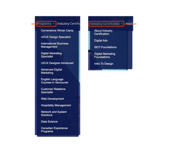
The website suffers from unclear and inconsistent navigation because it is often patched with 'quick fixes' during program updates.
❌ Problem 1
Inconsistent functions of labels in navigation
The five dropdown in navigation has same styling. One of the five labels of dropdown is clickable, and it links to a page. However, other labels of dropdown is non-clickable.
❌ Problem 2
Confusing hierarchy of labels in navigation
The term “Program“ encompasses both non-diploma and diploma programs.
In contrast, “Industry Certificates“ fall under the same category in the header but should be ranked lower in the hierarchy than “Program“.

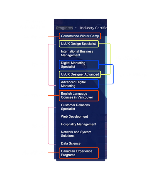
❌ Problem 3
Confusing hierarchy & order in dropdown
The order is neither alphabetical nor categorized.

REDESIGN
We redefined the hierarchy and categories for more coherent and clear navigation.
After we mapped out the structural and visual issues of navigation, we redesigned for decreasing cognitive load for users.
✅ Solution: Clearer navigation
Decreased texts, clear labels and added new categories.

Analysis in collaboration with Chayanin Kosol and Miguel Valdes.
✅ Solution: Better navigation
Decreased texts, clear labels and added new categories.


MY DESIGN FOCUS
Design One, Apply to All
Each team member was responsible for designing a specific page. I chose to focus on the UI/UX Design program page, to create a template that could be applied to other program pages as well.
To begin, I conducted a thorough audit of each section of the existing page. Based on the insights gathered from our questionnaire, I made several iterations to enhance the design and usability. This iterative process ensured that the final design addressed the key issues identified by users and provided a cohesive, user-friendly experience.
MAIN DECISION 1
Make Crucial Information Transparent
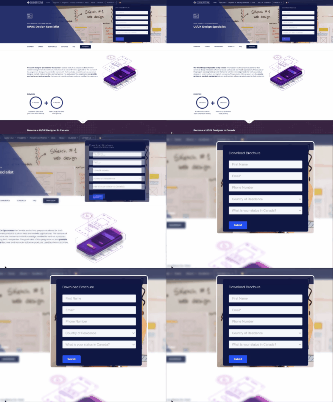
Problem:
After filling out the form with personal information, people anticipated getting value from the brochure. But, there was no new or detailed information in brochure.
Solution
Transparency is the key to building trust, so removed the form for getting the brochure.

INSIGHT 1
"When tuition wasn't available (or was hard to find), it scared me away."
INSIGHT 2
"I felt deceived when gave out my personal information only to receive general information."

Personal data is valuable these days, so it can be frustrating to be asked for your email just to access general information available on the website.

The moment I couldn't find the prices, I thought the tuition might be too expensive to show, so I immediately closed the page.
MAIN DECISION 2
Made information clear & glanceable
Problem
There's no clear hierarchy for information, making users hard to understand and glance.
Solution
The visualized information breaks up text, making the content appear less daunting and more glanceable.
RESEARCH DATA
25% of people think...
It was hard to understand the difference between the 1-year and 2-year programs, but the information could be presented in a clearer way.
Can the information be present simply and abstractly? There's too much information.
Keep information and showcases to a minimum...need things that would grab the attention of the people at a quick glance.
SOLUTION 1
Tables break up text, making content less daunting and more glanceable.

Before
After

SOLUTION 2
Combine the two similar programs(pages) into a single page to reduce confusion and offer a clearer comparison.
Before
1. Users can’t tell the difference between these two programs, so they have to click on each.
2. After they clicked on each page, they found only 2 places are different and they can’t find tuition in the program pages.

After


MAIN DECISION 3
Highlight highlights: Monthly Activities, Learning Outcomes, & Career Support
Students suggested features that would attract them to apply. CICCC has monthly school activities, various portfolios from design and engineering programs, and career support services like resume and portfolio reviews. These attractive services are not promoted on the website, so it would be beneficial to highlight them.
RESEARCH DATA
47% of people think these attract them
I want to access the class calendar more easily.
I hope to learn more about where the class can bring me, so I'd like to see students' final portfolios.
Career support helps students with job hunting and networking.
I didn't know about the school activities until I arrived, and I was so excited when I found out! Promoting these activities on the website will attract more international students.
Prototype
Existing Cornerstone College's website
Style guide
Categorized by Atomic Design


Feedback
Users praised the updated information viewing experience, stating how it bridges the information gap between users and the college.
"Great design! I really like the tables for the course and the tuition, well-organized." - Ayako
"Amazing that learning outcome! Such a good idea" - Maryin
"I almost went to the wrong location on my first day of school... Thank guys for thinking about that!" - Hadassa
NEXT
Examine & Iterate Design Decisions
As we move forward, it's essential to validate the feasibility and impact of our new design. To do this, we'll focus on several key aspects:
1. User Flow Conversion Rate
To determine the effectiveness of our redesign, we will collaborate with engineers to track the user flow conversion rate. This will help us understand how many users are completing the desired actions, such as navigating through the program pages and applying to the college.
2. Measuring Design Impact
One of our primary goals is to assess how many people are motivated to apply because of the new design. By implementing the new design flow and closely monitoring user interactions, we can gather valuable data.
3. Utilizing Google Analytics
We will set up Google Analytics to track user behavior on the website. This will allow us to see how users navigate through the site and identify any bottlenecks or areas for improvement. By analyzing this data, we can make informed decisions to further enhance the user experience.
These steps will provide us with actionable insights and ensure that our design not only meets user needs but also drives the desired outcomes for the college.
Other projects
Featured UX/UI Project / 2023

